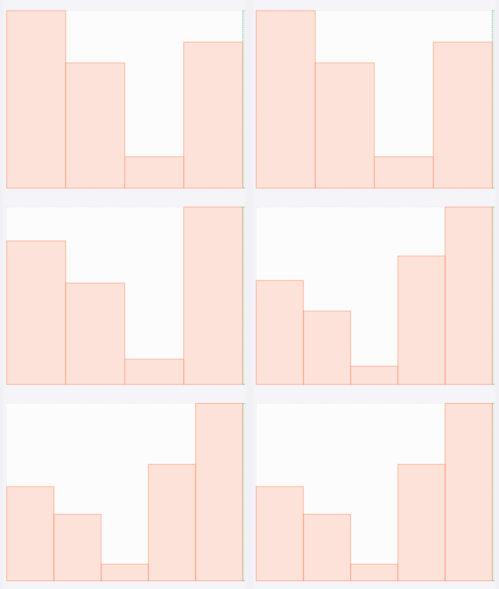
A simple bar chart
We will create a simple bar chart. The purpose is to show the functionality of dapentry on a familiar visualisation. Here is the final result:
Things will be done in a way that may seem overly complicated. This is because, one of the goals is to make the chart independent of the number of values and the size of the drawing container.
The Data
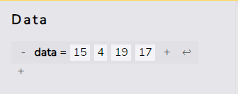
Create a new data value by clicking the
 -button.
Double click
it and rename it to
data
Turn it into a list of values
by clicking the
 -button at the end a couple of times.
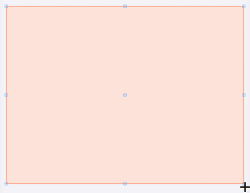
Base rectangle
Now draw a rectangle (R). Draw it so it covers the whole canvas. Use the canvases snap points to be precise.
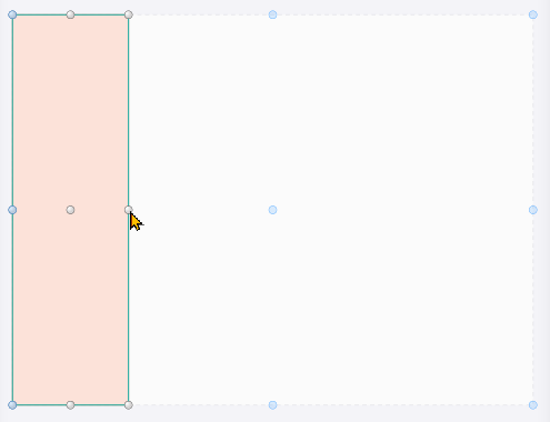
The width of the bars
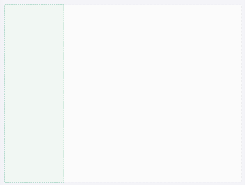
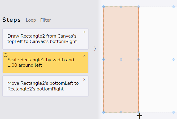
Scale (S) the rectangle to a vertical bar. Grab the right handle of the rectangle and move it somewhere to the left. The exact width is not important. We basically just want to create the scaling step.
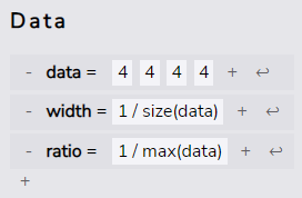
Now create a second data value. Rename it to width. For the value we'll use the following expression: 1 / size(data) This is our actual scaling factor for the bars.
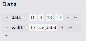
Select the scale step (click) And then drag the width onto the x-factor of the scaling step.

We now have determined the width of the bars in a way that all bars will always fit onto the drawing, no matter the size of the drawing or the number of data points.
Looping
Make the rectangle a guide-object by selecting it and hitting the H-key
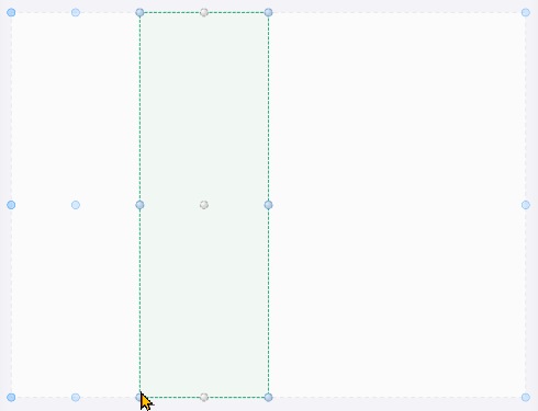
Now shift the rectangle one width. Make sure, it is still selected. Use the move (G)-tool and move the rectangles bottom-left handle onto its own bottom-right snap-point
Now we create the actual bar. Select the scale step for the guide rectangle, so the next operations happens before the move.
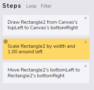
Create another rectangle (R) Make it the same size as the guide by using the snap-points.
Next, loop the last two steps - the creation of the bar and the move of the guide. Select them (hold Shift) and click the loop-button.
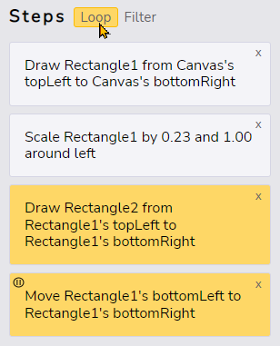
We now have 4 bars, since by default a loop repeats 4 times.
Iterate over data
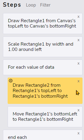
Let's change the loop into an iteration over the data Drag and Drop the data -field onto the iteration variable of the do-step.

Since we dragged the value list onto the iteration value of the loop, the loop will automatically turn into an iteration over that list using For Each
Now there will always be as many bars as there are data points. When you add a data point, a new bar will appear and the bars width will adjust so all bars will fit onto the drawing.
You can try this
by adding new values to the
data-field
using the -button
Size the bars
In this last step we will adjust the size according to the data.
First create another data field. Call it ratio and set it's value to 1 / max(data) This will be the base ratio by which we'll scale the bars. They will therefore always fit onto the drawing.
Now select the step within the loop were the actual bar is created
Scalethe bar by grabbing the top-handle and moving that down. again, how far you scale is not important we just need to create the scale-step.
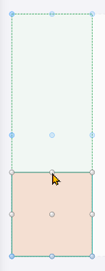
Select the scale-step we just created.
Drag the data-field onto the y-factor

You may have noticed, that the name used is for the scale factor $data. This is done to disambiguate the list from its values. By this you can do nested loops where the inner loop either iterates over a list again or repeats by the value of each list item. This should be useful for more advanced visualisations.
The bars are now way to big. So we multiply the scaling factor by the ratio we created before. With this, the largest bar will always use the complete height of the drawing.

We're done! A simple bar chart. Try changing values or adding some. The chart will adjust accordingly.
